With the prices of 4K/UHD television panels starting match those of standard HD TVs from barely a year ago, it’s only a matter of time before everyone in the broadcast industry will need to gear up to handle 4K content. Since 4k is all about improving the quality of the viewing experience, color grading or correcting this content is a critical step toward meeting client expectations.
The first place to start working with 4K/UHD content is to make sure you have the necessary equipment in house, ideally a Tektronix WFM8200 or WVR8200 waveform monitor which can be field upgraded to handle 4K/UHD. With the upgrade in place, you’ll have access to a number of useful tools and displays that can make short work of color grading projects and quickly deliver stunning results. In this blog post, we’ll walk through a few examples of these tools in action.
Primary color grading is the first step in a traditional color grading workflow which involves applying tonal range and color gradings to the entire raster or image. Primary color gradings usually start with spreading out the tonal range to its fullest natural extent. Images that don’t have this “spread” appear flat or washed out.
Looking at the screen capture from a WFM8200 display below, you can see that blacks are not at 0 and whites are not at 700 mv. To fix this, you would then use the shadow, black or lift control to bring down shadows to their lowest legal level. For all forms of video and any form of video created digitally and viewed digitally, the level should be 0. Then you would bring the highlights up to 100 using the simple scale provided by Tektronix waveform monitors. One of the advantages to good waveform monitors, like the WFM8200 and WVR8200, is that you can zoom in to the blacks or the highlights to really see the fine detail.

The Tektronix Waveform Monitor shows that the image doesn't take advantage of the full dynamic range. Blacks are lifted (above 0) and whites aren't at 100% (or 700 mv).
Remember that not every image has something that “deserves” to be 0 black or 100 white. You need to look at the image and see if there’s something that should actually be deep black or bright white. If there is, then spread them out to 0 and 100. With the highlights and shadows adjusted to legal and appropriate levels, you may not be happy with the overall brightness of the image. Gamma or midtone controls allow you to change the overall look. The results of a gamma adjustment are shown below, which of course can be done to taste, and may depend on the darkness of the shots around it.

This is the image after the gamma adjustment. This can be done to taste, which could depend on the darkness of the shots around it.
With the tonal ranges set, you may want to see if there’s an overall color bias you want to get rid of – like a bad white balance. Or, you may want to introduce a color bias to a neutral shot – perhaps to make it look like "golden hour" as shown below. Or maybe you want to have the color grading tell part of the story of the shot, like making it cooler or warmer or show more contrast

You can add effects such as a warm, “golden hour” look.
To understand how to use the instruments, you need to know where the image is supposed to be in the first place. The RGB parade shown below is like a regular waveform, but it shows the relative values of each of the red, green and blue channels. To form pure, balanced black, white or gray, you need to have equal amounts of each channel. In an RGB waveform, if the bottom of the blue channel is higher than the bottom of the other two, then you have blue in your blacks. If the red channel is a little higher at the top of the waveform than your blue or green channel, then your highlights are a little pink or red. For a lot of shots, all you have to do is line up the bottoms of each channel and the tops and you’re balanced. There are exceptions, especially with shots with a lot of a specific color – like a huge swath of grass, for example.

This is a balanced chip chart.
Another way to balance colors is to look at a vectorscope. On a vectorscope, pure black, white and gray – no matter how bright they are – all sit at the center of the vectorscope. Generally speaking, the further from the center, the more vivid the color appears due to either saturation or value. The hue is shown by the rotation around the circle. You don’t want the entire trace in the middle – that would mean it’s just black and white – but as you manipulate the image while looking at the vectorscope you can see what parts need to sit closer to the center as show in the image below.

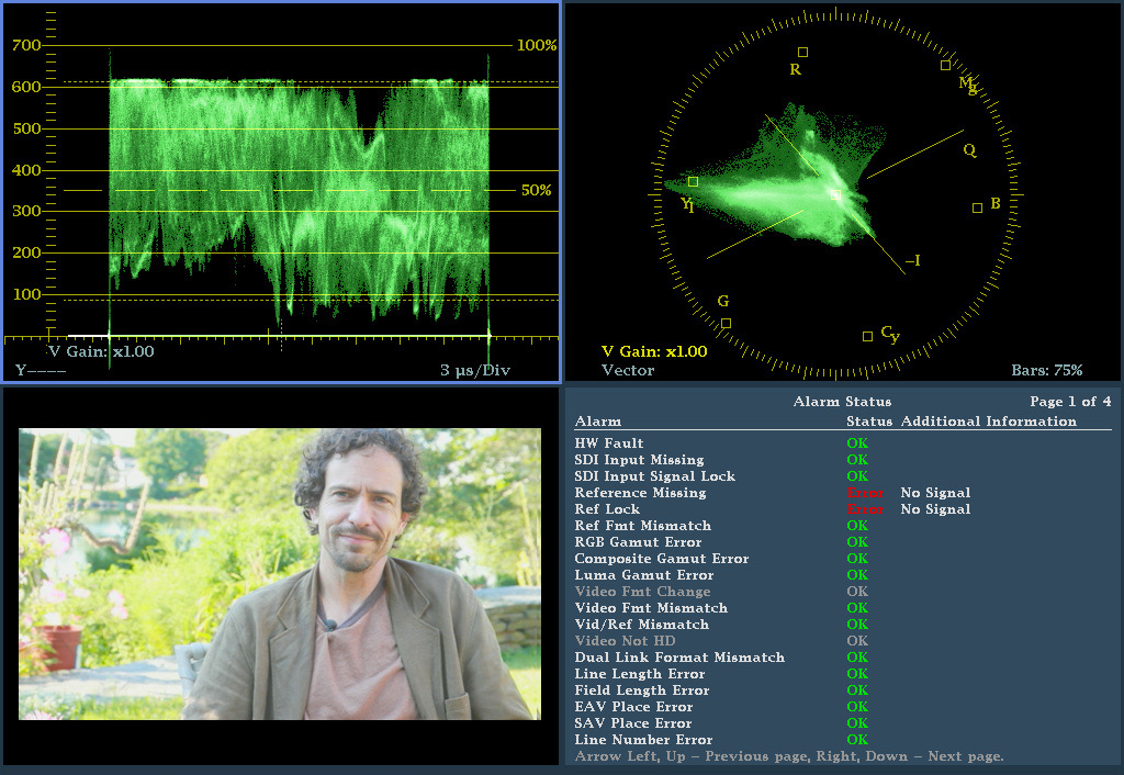
This is a Vectorscope of a typical image such as an interview set in a backyard. The trace shows the red of the skin tones and the yellow/green of the grass and a bit of blue sky.
An exclusive variation on the vectorscope is Tektronix’s luma qualified vector, or LQV below. This allows you to display just a specific part of the tonal range – like just the deep shadows or just the highlights – in the vectorscope, which can really help you to balance shots.

Tektronix's Luma Qualified Vectorscopes are an exclusive feature that allow you to show a vectorscope image for a specific tonal range. In this case, only up to 50 mv. So this is showing the shadows or darkest parts of the image.
To learn more about the WFM8200 and WVR8200 go to: www.tek.com/waveform-monitor/wfm-wvr8000-series
For more detailed tutorials be sure to check out the video by expert colorist Steve Hullfish on the Art of Color Grading available on You Tube: https://www.youtube.com/watch?v=RohduOvrrTg